mirror of
https://github.com/BoostIO/BoostNote-App.git
synced 2026-04-26 21:05:55 +03:00
[GH-ISSUE #769] Editor and Markdown preview Monokai theme modify and fonts looks a little blur #401
Labels
No labels
android 🤖
assigned to core 🦹
bug 🐛
documentation 📚
documentation 📚
duplicate 🚫
external issue 🔼
external issue 🔼
feature request 🌟
funded on issuehunt 💵
help wanted 🆘
improvement request 🔨
improvement request 🔨
ios 🍎
mobile 📱
needs investigation 🔬
needs more info ℹ️
needs specs 📐
plugin idea 🔌
plugin idea 🔌
poll 🗳️
pull-request
question ❓
rewarded on issuehunt 🎁
security issue 🔑
won’t fix ❌
No milestone
No project
No assignees
1 participant
Notifications
Due date
No due date set.
Dependencies
No dependencies set.
Reference
starred/BoostNote-App#401
Loading…
Add table
Add a link
Reference in a new issue
No description provided.
Delete branch "%!s()"
Deleting a branch is permanent. Although the deleted branch may continue to exist for a short time before it actually gets removed, it CANNOT be undone in most cases. Continue?
Originally created by @wu-yue-yu on GitHub (Jan 22, 2021).
Original GitHub issue: https://github.com/BoostIO/BoostNote-App/issues/769
Current behavior
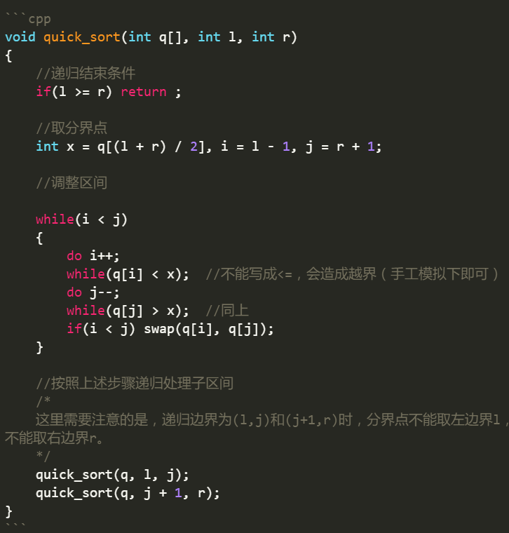
I use this font Consolas-with-Yahei both in Sublime text 3 and BoostNote( in Markdown preview and editor), but there're some little things got different. Could anyone help check it? This font makes Consolas and Chinese characters look good.
In editor mode(Their themes are the same -- Monokai):
In Sublime(The detais are in the expected behavior)
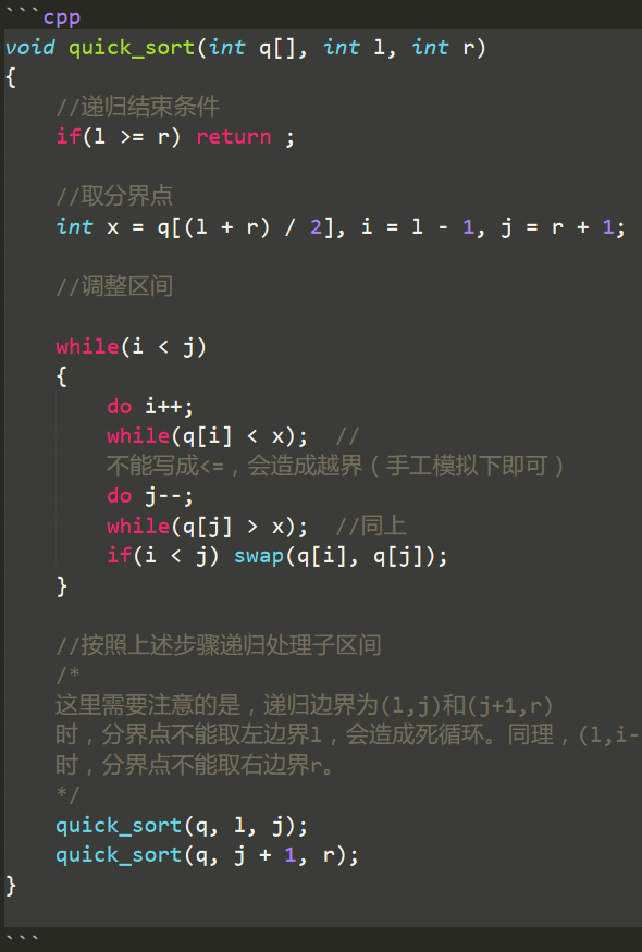
In BoostNote
the color of highlight I prefer Sublime, and Sublime also make the function name and storage type name display in Intalic. Is there anyway to make the same look happen in BoostNote?
Also, the keyword in highlight (e.g. the "if", "while", "return") , looks a little unclearly(blur) in BoostNote.
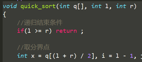
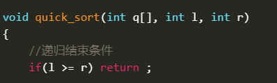
In Markdown preview mode:
The font Consolas-with-Yahei is not completely shown, see this pic:
Right way:
In BoostNote's Markdown preview(a little blur)
Expected behavior
About the Monokai in sublime
The details please check in this site
I think sublime's theme looks better and clearer.
About the font
The details please check in this web Consolas-with-Yahei
If you have time, could make the two things above display better in BoostNote? Thanks!
I like BoostNote very much, this is the best one after I've tired many notes software! :)
Thanks for reading my issue :)
@wu-yue-yu commented on GitHub (Jan 24, 2021):
BTW, the theme of BoostNote is Legacy.