mirror of
https://github.com/benbusby/whoogle-search.git
synced 2026-04-25 12:15:50 +03:00
[GH-ISSUE #60] [FEATURE] Theme/color scheme/UI customization #39
Labels
No labels
Fixed (Pending PR Merge)
Stale
bug
enhancement
enhancement
good first issue
help wanted
keep-open
needs more info
pull-request
question
theme
unfortunate
No milestone
No project
No assignees
1 participant
Notifications
Due date
No due date set.
Dependencies
No dependencies set.
Reference
starred/whoogle-search#39
Loading…
Add table
Add a link
Reference in a new issue
No description provided.
Delete branch "%!s()"
Deleting a branch is permanent. Although the deleted branch may continue to exist for a short time before it actually gets removed, it CANNOT be undone in most cases. Continue?
Originally created by @edmael on GitHub (May 18, 2020).
Original GitHub issue: https://github.com/benbusby/whoogle-search/issues/60
Describe the feature you'd like to see added
It would be nice to have the chance to edit the Logo/colors in homepage and hide the configuration option.
Basically if I run it on my server I'd like an easy way to give my search engine a nicer looking look and hide the "Configuration" line beneath it so if I share that URL people can search and not edit the options.
Describe which parts of the project this would modify (front end/back end/configuration/etc)
Mainly frontend, but maybe this can be integrated with #43
@ilovepancakes95 commented on GitHub (May 20, 2020):
I second this request. Customization, especially at least major elements like logo would be great.
@BeecherNetworks commented on GitHub (May 22, 2020):
Thirded! In the meantime, you can do some customisation by copying the CSS file out of the container, editing it, and copying it back in again.
I changed the primary colour in Vim with
:%s/685e79/0069A8/g, and added the following to the top to hide the logo and the customisation panel. (I also tried to hide Whoogle from the top of the results page but that hasn't worked, need to look at it again.).logo, #config-collapsible, .cOl4Id { display:none !important }If you want to change the logo, copy yours to
/usr/src/app/app/static/img/logo.png.@edmael commented on GitHub (May 22, 2020):
I think that's because the result page use an inline css style and the logo seems to be wrapped in a .cOl4Id class. Don't know why is that, maybe @benbusby can shine some light on this.
@benbusby commented on GitHub (May 22, 2020):
Hiding the Whoogle logo should be as simple as adding
display: none !importantto the.cOl4Idclass (which is a class used by Google, not controlled by me). Just tried it out and it works, but since I'm rewriting Google's inline styling in place, you'll have to load in your own stylesheet indisplay.html(or add a line to importmain.csswith your changes).I agree that this would be a nice feature, but it's not a huge priority just yet. I'd like to focus on core functionality before moving to aesthetic/preferential features, but I'm more than happy to accept any PRs implementing something like this. I don't imagine it would be too hard, and it sounds like you guys are already ahead of me on this front anyways!
@BeecherNetworks commented on GitHub (May 23, 2020):
So main.css is loaded on the homepage but not on the results page?
@benbusby commented on GitHub (May 23, 2020):
@BeecherNetworks correct
@benbusby commented on GitHub (May 26, 2020):
Pinning this issue so that anyone can see this first before suggesting that I add in a specific theme.
@BeecherNetworks commented on GitHub (Jun 11, 2020):
FYI, this is easier now as search.css is common to the landing and results pages. I'm sure the CSS or parent folder could be mounted as a volume, but for now you can just copy out search.css, add your changes and copy it back in again.
I added the following CSS to hide the logo, footer and config.
.logo, .logo-div, #config-collapsible, footer { display:none !important }@benbusby commented on GitHub (Jun 12, 2020):
Great idea from @BeecherNetworks, but also worth mentioning that as of version 0.2.0 the config settings are now stored per session rather than only having a single config file per instance, so there shouldn't be a need to hide this anymore (unless you just don't want it shown in general).
@BeecherNetworks commented on GitHub (Jun 12, 2020):
Yes, I'm just hiding it for myself, once it's set I won't be changing it.
To save me the hassle of testing, do volumes needs to be preset in the Dockerfile, like ports, or can you just mount anything in the container?
@benbusby commented on GitHub (Jul 9, 2020):
Merging in #100 with this issue:
@zhdenny commented on GitHub (Aug 19, 2020):
The included Whoogle Dark theme makes it REALLY hard to read previously visited site titles. Do you guys agree? Dark Purple on Dark Background just doesn't work....How do I fix this via css edit? I tried but nothing worked and this is so annoying it is preventing me from using the Dark Theme entirely. There are even other elements in this theme that seem to be really bad color choices as well...the Search FIeld text is another example....
@benbusby commented on GitHub (Aug 20, 2020):
Yeah the dark theme needs work for sure. I've been putting off working on it for a while since my (limited) time is better spent on fixing or adding functionality to the tool. I'm still holding out hope that someone jumps in to add in theme customization soon.
Anyways, the visited link color is a color added inline by google when being passed back through to the client
Overriding that style with whatever you prefer would get rid of this issue, though it's not really a satisfactory workaround. I personally stopped using the dark theme a while back and wrote a custom theme for DarkReader that works a lot better in my opinion, at least as a temporary solution until this gets implemented.
The DarkReader theme is applied as a static (not dynamic) theme on top of the default whoogle theme (not the dark one), and looks like this:
CSS here:
@benbusby commented on GitHub (Aug 20, 2020):
Since I had a free moment, I actually went ahead and implemented a new dark theme based on the one mentioned above. The new dark theme uses a dedicated stylesheet for all color replacements, rather than relying on the filter process, and as a result should be much easier to edit for anyone looking to customize it in a hurry. Could still be improved upon most likely, but at least it's something I'd consider usable now.
If anyone wants to check out the branch (
feature/new-dark-theme) and see it for themselves and/or add suggestions, feel free. If all looks good as a temporary solution, I'll merge it to dev.@devn3t commented on GitHub (Sep 26, 2020):
The only thing keeping me from using Whoogle instead of Searx at this point in time is the width not being adjustable. It looks tiny and horrible on a widescreen monitor and it makes me cringe every time I visit my search results.
Theming would be nice...I wouldn't be mad at it.
@benbusby commented on GitHub (Mar 21, 2021):
Custom CSS styling and theming is now included as a config option with #227. The github wiki has also been updated (see here and here) with a guide for changing color schemes and the (short) list of contributed user themes. Additionally since the inclusion of custom CSS extends beyond just color theming, result widths can be tailored to a user's liking as well (see the wiki for an example). Fine grained control of the UI is still a bit difficult since the element class names are obfuscated by google, but isn't too terrible to work around with some patience and "inspect element".
@LeonMusCoden commented on GitHub (Jul 11, 2021):
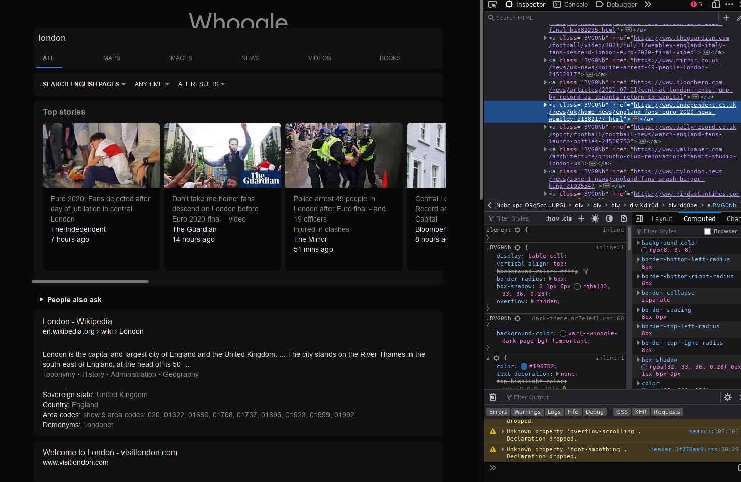
The dark theme does not change the colour of the top stories:
Taking a look at the DOM elements, all the stories are contained in a div with a class called "idg8be". Each card has the class "BVG0Nb" and changing the background-color of the individual cards solves the problem
@gripped commented on GitHub (Jul 12, 2021):
Which browser are you using ?
I just tested on Firefox and Chromium on Linux, and Edge on Windows.
Still works as intended here. Firefox:
You can see in that screenshot that .BVG0Nb has background-color set to --whoogle-dark-page-bg by dark-theme.css
@LeonMusCoden commented on GitHub (Jul 15, 2021):
I used an older version of firefox (V 87.0 to be exact). I tried reproducing it, but had no luck
@KaiDevrim commented on GitHub (Sep 8, 2021):
Have the ability to change the Whoogle display name or just hide it.
@jackyzy823 commented on GitHub (Sep 20, 2021):
Configuration dialog cannot be closed in low DP mobiles.
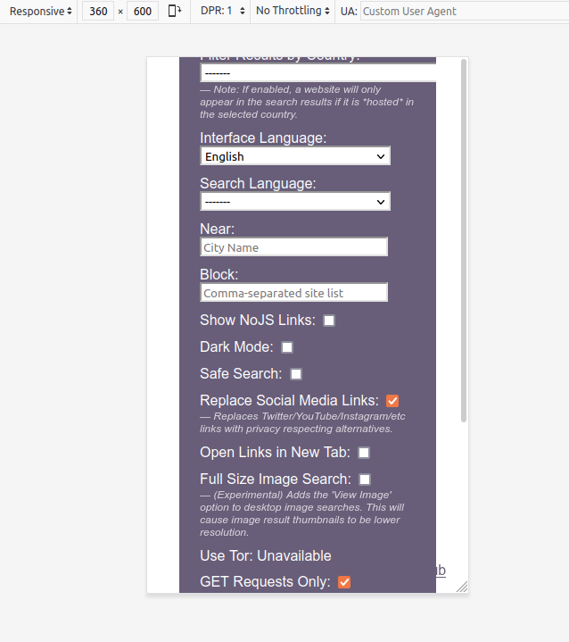
For example like 360x600:
@astier commented on GitHub (Oct 13, 2021):
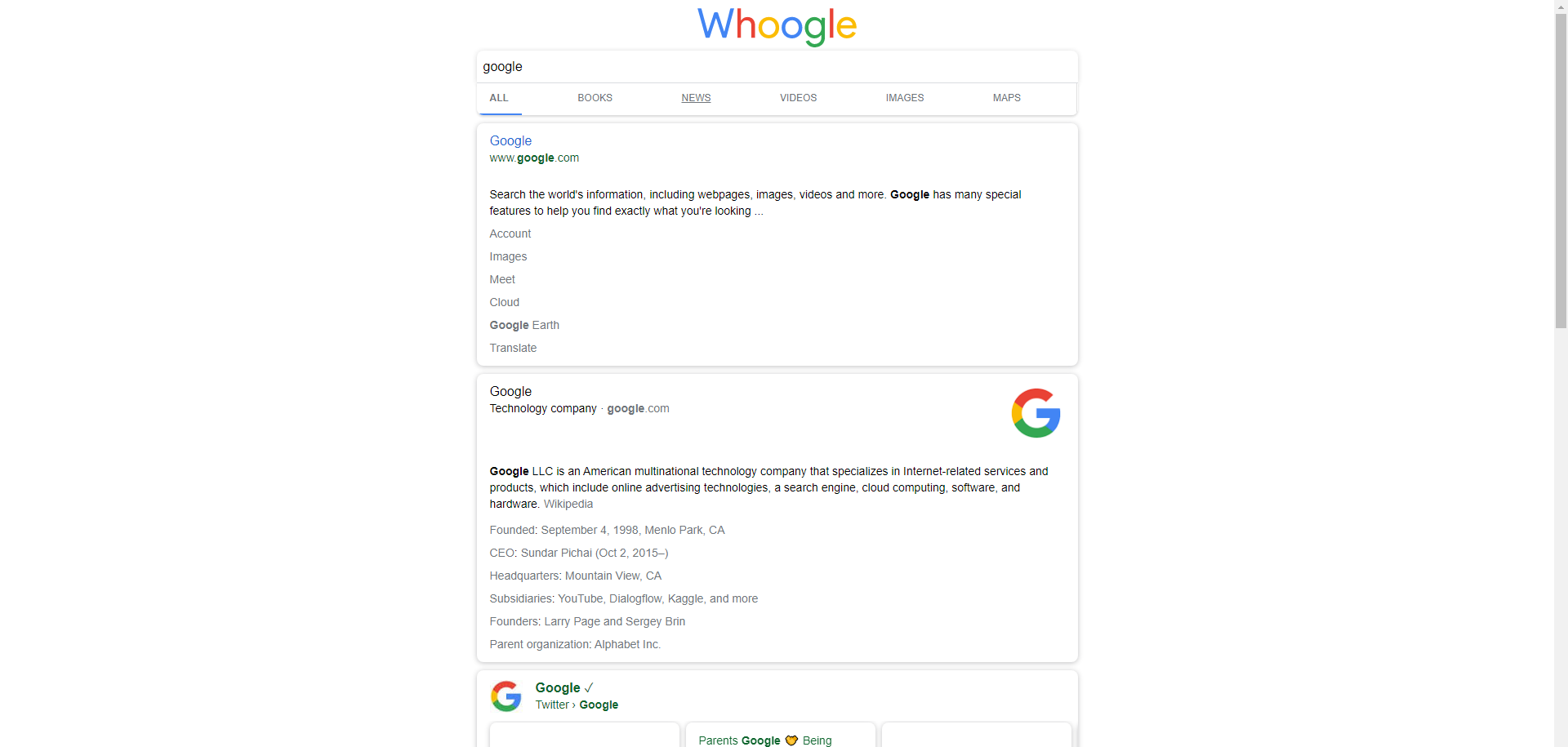
Problem
I would like to request a
minimal-mode. I usually only want to see the results as:Right now there are other elements which I don' like to see:
Some of this elements can be minimized like "People also Ask", some other I can block with the zapper-tool form ublock, but other like Summaries/Biographies I can not remove.
Solution
minimal-modeoption which if set reduces the results-list to only the titles, urls and descriptions of the respective results.Notes
I always liked the minimal look of startpage which only shows a list of results consisting from title, url, description. They have an instant-answer feature but there is an option to disable it.
This feature would reduce information-overload, visual clutter and for some people may be also more visual appealing.
If I want to see a biography and facts I click on the wikipedia result. If I want to see the tweeter-feed I open the twitter-result. If I want to see the images/news I click on the images/news-category, etc.
Screenshots
Joe Biden Summay and Top Stories
Long Short Term Memory with an Image-Feed
Albert Einstein Summary with his books
Albert Einstein with Facts-Lists under every result
@DUOLabs333 commented on GitHub (Oct 24, 2021):
@astier I think I have a fix, but I can't cause the problem to reliably show up. Does it still happen if you update?
@Brenders commented on GitHub (Jan 22, 2022):
hi i have a request about whoogle gui it is desktop mode, at this moment whoogle is with the graphics of the mobile version not very suitable for pc screens such as a 1080p or a 2k, 4k, etc. would it be possible to have the implementation of desktop mode?
@DUOLabs333 commented on GitHub (Jan 22, 2022):
@Brenders I'm assuming this is due to the fact that the rows are short and centered in the middle, and not stretched out? If so, then there is a config for that.
@Brenders commented on GitHub (Jan 23, 2022):
I see the site like this
@DUOLabs333 commented on GitHub (Jan 23, 2022):
You want something like this:
@ThatOneCalculator commented on GitHub (Feb 8, 2022):
I'd really love to be able to add a custom logo, or even just change up the text!
@Waldorf3 commented on GitHub (May 2, 2022):
I couldn't get this to work, the docker-compose kept complaining about the quotes. Ended up just adding
body {max-width: 80% !important;
in the configuration - css box, and that was exactly what I wanted.
@LouA1 commented on GitHub (Jun 1, 2023):
I second this option. All I want to do is change Whoogle to Lougle. How do I do it?
@moritzfl commented on GitHub (Jul 19, 2023):
I do believe the given examples for the css environment variable are wrong. The following configuration worked for me:
@ghost commented on GitHub (Oct 16, 2023):
Hi, the recently introduced search result icons (started in
github.com/benbusby/whoogle-search@4292ec7f63) work fine. I do appreciate all the work that's being done to keep whoogle-search in good condition, but I have to admit this new feature isn't adding anything value for me personally. Just as a matter of preference, I keep my web searching as unclutered/minimalistic as possible.Realizing the work on this just started I wanted to ask if there's a knob planned to
disablefavicons for each search result? Is this something that's being considered?For now I use user CSS in Firefox to remove them from view:
But AFAICT the favicons are still being downloaded and that (slightly) slows things down.