mirror of
https://github.com/mthenw/frontail.git
synced 2026-04-26 02:05:57 +03:00
[PR #121] [MERGED] Add viewport width to support responsive design #200
Labels
No milestone
No project
No assignees
1 participant
Notifications
Due date
No due date set.
Dependencies
No dependencies set.
Reference
starred/frontail#200
Loading…
Add table
Add a link
Reference in a new issue
No description provided.
Delete branch "%!s()"
Deleting a branch is permanent. Although the deleted branch may continue to exist for a short time before it actually gets removed, it CANNOT be undone in most cases. Continue?
📋 Pull Request Information
Original PR: https://github.com/mthenw/frontail/pull/121
Author: @andrew-js-wright
Created: 4/11/2018
Status: ✅ Merged
Merged: 4/11/2018
Merged by: @mthenw
Base:
master← Head:fix/mobile-viewport📝 Commits (1)
be498a6Add viewport width to support responsive design📊 Changes
1 file changed (+2 additions, -1 deletions)
View changed files
📝
web/index.html(+2 -1)📄 Description
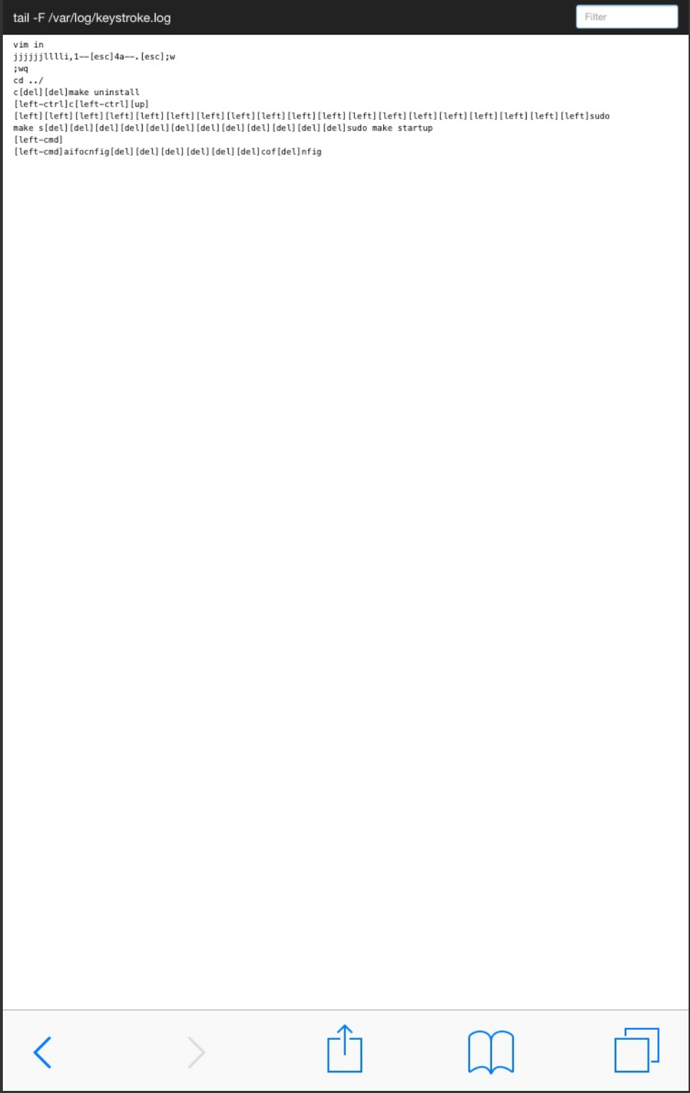
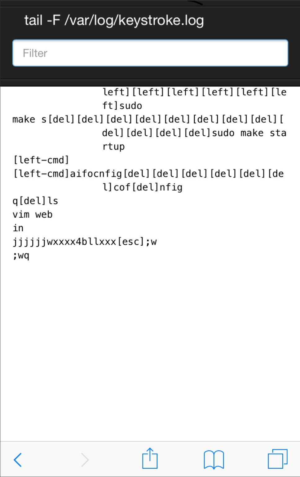
The UI is built to respond to the width of the screen it is being
displayed on and provide the best experience across devices. When I tried
to view logs streaming on my phone (Apple iPhone 6s), site was
attempting to render the "bigger-screen" version.
This is because, by default, mobile browsers advertise a bigger "view
port" than screen size, to allow compatibility with non-responsive sites.
In order to benefit from the responsiveness provided, the viewport meta
tag needs to be overwritten. More on that tag can be found at
mdn.
Before
After
🔄 This issue represents a GitHub Pull Request. It cannot be merged through Gitea due to API limitations.