mirror of
https://github.com/1Remote/1Remote.git
synced 2026-04-25 13:36:03 +03:00
[GH-ISSUE #34] UX improvements discussion #1945
Labels
No labels
area-configuration
area-ct-app
area-ct-rdp
area-ct-remoteapp
area-ct-ssh
area-ct-vnc
area-launcher
area-list
area-tags
area-teamwork
bug
chore
dependencies
general-build/ci
general-performance
general-refactor
general-security
general-supportive
general-ux
meta-documentation
meta-enhancement
meta-enhancement
meta-feature
meta-help-wanted
meta-unknown-error
priority-hi
priority-low
pull-request
question
resolution-duplicate
resolution-invalid
resolution-wontfix
stale
task-put-off
task-still-considering
task-working-in-progress
No milestone
No project
No assignees
1 participant
Notifications
Due date
No due date set.
Dependencies
No dependencies set.
Reference
starred/1Remote#1945
Loading…
Add table
Add a link
Reference in a new issue
No description provided.
Delete branch "%!s()"
Deleting a branch is permanent. Although the deleted branch may continue to exist for a short time before it actually gets removed, it CANNOT be undone in most cases. Continue?
Originally created by @majkinetor on GitHub (Dec 9, 2020).
Original GitHub issue: https://github.com/1Remote/1Remote/issues/34
Originally assigned to: @VShawn on GitHub.
Name&Address).products do that so (unless you are full screen) you always know how critical environment is by the border and background colors on various places (this could affect main view, launcher view, tab color etc.)
see dbeaver for inspiration (red prod, yellow stage, white devel)
@VShawn commented on GitHub (Dec 9, 2020):
I had a plan for these, the operation logic just like what you list out. AMOF I just stuck at interact design like UI and animation since I know few about design things.
@VShawn commented on GitHub (Dec 9, 2020):
sorry, i not sure hovering animation means which animation?
Logo zooming? or box border change?
@majkinetor commented on GitHub (Dec 9, 2020):
Sorry didnt even notice the border change :) Logo zooming. Not to mention that logo zoomed looks pixelated.
@Shooshka commented on GitHub (Dec 9, 2020):
UX related I think... tranparent isn't good for all pictures ;)
@majkinetor commented on GitHub (Dec 9, 2020):
Added 2 more items (logo save and color)
@VShawn commented on GitHub (Dec 10, 2020):
In the very begining, there was a color border around session work area, use to identify sessions.
but now color only shown on tab since I found it ugly to have a color border around.
@VShawn commented on GitHub (Dec 11, 2020):
I made a demo page for management, just for feasibility analysis
@majkinetor commented on GitHub (Dec 11, 2020):
Looks great 🥇
@profbaco commented on GitHub (Dec 14, 2020):
This idea of seeing items in list form is interesting! I was going to open an issue for this myself.
Esta ideia de ver os itens em forma de lista é em interessante! Eu mesmo ia abrir uma issue para isto.
@majkinetor commented on GitHub (Dec 15, 2020):
Updated issue with 8.
details
This option is great when working on laptops/movable devices like surface where vertical space is severely limited.
@VShawn commented on GitHub (Dec 15, 2020):
enjoy being with #28 🌝
@majkinetor commented on GitHub (Dec 15, 2020):
OK removed that one, added new one:
The point here is this - app starts remote connection very fast, so I don't keep them around, i just close them and relaunch them when I need it again - this is what I prefer since while you are on the remote, you cant easily alt tab with your host and when alt tab enters the remote, you cant easily go out to host particularly on full screen.
For that rason I keep remotes windowed or maximized which resets always when I close the main app window. Since resizing takes time (at least 2-3s), and is glitchy and sometimes it doesn't resize, it would be way better to remember.
@VShawn commented on GitHub (Dec 15, 2020):
size remember
It did remember lasest tab window size
But the point is: in tab mode window, new remote session will be attached into the on tab.
So if we open a 200 X 100 remote session A first, then try to open a 300 X 100 remote B, this B session will not open with size 300 X 100, but just join the Tab of session A and become a 200 X 100 size session. I dont know how to handle these above, so I just leave it alone when i build tab module.
maximized state are not remember
I will mark this and add maximized state remember next turn.
@majkinetor commented on GitHub (Dec 15, 2020):
Yeah, that only makes a problem with resize mode
fixed. And to jump sizes when you over tabs, thats retarded and won't work well anyway. So perhaps this setting should be removed ? Or to document that it only works if there are no other active connections.@majkinetor commented on GitHub (Dec 16, 2020):
Added
@VShawn commented on GitHub (Dec 21, 2020):
fix by make icon small
@VShawn commented on GitHub (Dec 21, 2020):
@majkinetor commented on GitHub (Dec 24, 2020):
Few observations about latest release 0.5.7:
Edit selection
Why didn't u reuse existing UI to create connection. You could just gray fields that are not changable in group such as Name (its strange you left it). This is IMO much better since UI is familiar already
details
Fields that are crossed should be disabled in group edit:
List
ctrl +|-or mouse ?Icons
@majkinetor commented on GitHub (Dec 24, 2020):
Or if you go with your current approach, you could totally ignore this and make ALL fields settable in group, if that is what user wants for some reason.
Its enough that name and address are similar for this feature to be usable even for name/address. You could for example have the same name and IP prefix for group of servers (typical in my case) which you could then set to entire group and edit each item later individually to add suffix/change last IP number.
@VShawn commented on GitHub (Dec 25, 2020):
@majkinetor
Edit selection
no no, current approach not what i wanted, it just easy to implement for now software architecture.
and... Visual Studio approach is what I wanted, in case below crossed fields would show as '<different options>', but this needs re-design our code.
List
actually I don‘t know how to control global font size dynamically : ( , do you think font size is too small not?
server Icons/logo
I am going to add more icons, but I am not sure about the commercial authorization of the icons and I lost my source server logo design files for some reason. In addition, I feel that the style of font awesome doesn't match the current one.
@VShawn commented on GitHub (Jan 6, 2021):
we add tons of icons 😸
@VShawn commented on GitHub (Jan 28, 2021):
#69 Bug report form UX needs improvement
@xperia-droid commented on GitHub (Feb 16, 2021):
HI @VShawn,
thank you very much for the RDP tool. For me I already feel that it is a good and useful RDP tool. I have tried several RDP tools in the past, but none of the tools I have used as long as the outdated RDP Connection Manger, because it is no longer available. and the other tools I have quickly removed again because I always had something wrong with the tools.
I've been testing your tool for 2 days now and I'm very very happy about the dynamic customization of RDP resolution, that's a feature that no free tool I've had my hands on so far has had.
I would love to bring some suggestions:
Possibilities of an indicator: Either the text is changed in color, for example to green, or a check mark is added to the logo.
Or there is another column that points to it, but I personally find unnecessary with another column, because this can be built in by other ways.
If this would be built in color wise, you could integrate this into the themes section right away :).
As a Windows window icon, however, it works wonderfully, and here again thank you that there is such a feature with logo at all.
Regarding the performance, I noticed two things:
Searching for connections in the main menu is smooth, but if you search the RDP list in Quickconnect, you notice that it hangs significantly.
We have almost 60 RDP connections in the list to see that in relation.
If an RDP connection is disconnected, the session remains in RAM. In my way of working I often connect a lot to RDP servers and also disconnect / log off. Most of the time I "only" have 3 to 4 RDP connections active, but due to the closed RDP connections the RAM consumption grows to 2.5GB so far. If necessary, one can still optimize here that the RAM is released further. For me, the RDP software remains active most of the time, I try to avoid having to restart it.
Since the RDP manager of CINSPIRATION was 3x worse. There it went up to 5GB RAM.
I know it was already mentioned in other tickets, but in the workflow it helps a lot to have a tree structure in the RDP tool here, instead of a tab structure. Since IMHO more data can be displayed in the tree than a side tab structure.
Thanks for reading and for providing a new / fresh RDP tool :).
@majkinetor commented on GitHub (Feb 16, 2021):
I can't confirm this. I have around 50 connections and quick launcher works instantly.
This was reported previously (#37) and after it was fixed I didn't have any problems - as soon as RDP connection is closed RAM is released.
To workaround this, I name all my connections with group name as prefix which is simple and easy thing to do. I think you didn't express it right tho - I guess you want to , by typing the group name, PRM to show all connections in that group even if they don't contain that phrase in the name. It looks like you want to show the group itself, and what will it mean when selected ? show submenu ? Not very quicky and defeats the spirit of quick launcher. But first mentioned case makes sense (as an option ofcourse)
@xperia-droid commented on GitHub (Feb 17, 2021):
About QuickConnect:
In other words, search works fine, but when you delete text in the search bar, the delay before the letter is deleted is noticeable.
About RAM:
Yes, of course I could rename all my connections, and put the group name as a prefix. But then the names will be much longer than they already are and otherwise the question is, why there are groups at all, if you can't use that as a filter criterion.
In my case I have almost 20 groups, where a maximum of 5 servers are stored per group and then it makes IMHO sense to search the group names in the Quickconnect, and quickly find the appropriate server and open. Now and then I would also open all found servers via the way, because I have to work in parallel on all servers of the group.
Another point I found, from time to time I use a secondary account to connect to the server. So far I have opened a classic RDP connection to the server as a workaround. As an alternative, there would be the possibility to create the server twice and store the other credentials there, but makes the whole thing not really comfortable.
This point I found the mRemoteNG completely idiotic solved, or not at all. Since at the point not even the inheritance of the account data worked properly. Since I am then very quickly changed.
Although it looks like I'm writing badly about the tool. No, I think it is really well done and does a lot different and better than other RDP tools. Only these are points that I miss and I wish that they are integrated and therefore I am also looking forward to the future of the tool.
I can program C# myself, unfortunately only with WinForms, otherwise if I had time, I would like to support if this is desired :).
@VShawn commented on GitHub (Feb 17, 2021):
Hi @NAV-Management thank your for your valuable advice, sorry for relpy late, I just so busy these days 😵
I will think about how to add indicator 😉
errrrr which icon do you mean?

this one?
give a screen shoot would be good.
no sure if we can get the log out even from server side, i need to check the document.
You are right, group name should take place in the launcher, the reason why it not in launcher is that in the very original design(v0.0.1), there was no launcher for PRM. I add the launcher in v 0.1.0 : )
The point is I designed Quickconnect for myself, about 20 connections and it works very well, 60 connections was never been tested 😓. IMO hangs in the launcher is probably because:
For me, there is no idea to solve this problem temporarily. On my machine, the memory will be released within a period of time (a few secondes, 10s 20s) after closing the session, but it cannot be released completely
support are always welcome, WPF is easy to learn(IMO), I program C++ on work, C#/WPF is my emmm.... spare time entertainment, I am not very good at it.
thanks again for your valuable advices
@xperia-droid commented on GitHub (Feb 17, 2021):
I found another idea for an indicator:
Add a server type option field that could include fields like "Productive", "Testing", "Developing".
And in the theme settings, add a color range for the server types.
So in the example, if you set green as the color for Develop, blue for Test, and red for Productive. When you connect to a server, the color of the tab changes according to the server type it is. This way you can see at a glance where you are.
Regarding the logo topic, I mean that a self-made logo is hardly displayed in the tab:

Can you tell me what size the logo must be?
Regarding automatic closing the Tab, their should be documentation about it, because most rdp-tools can close it:


In Example RDP-Manager from Cinspiration:
Connect:
Successfully logged in:
Manually Logged off from Server:
Regarding RAM: yes most of the tools have the problem. But the RDP manager consumes a lot of RAM after some working time.
Regarding WPF programming: The GUI is very unique in this area, and I find it quite good
@xperia-droid commented on GitHub (Feb 17, 2021):
Sorry if I disturb you, but i found another bug:
When you log out of a Win 2008 R2 server, you will be logged back in automatically if you are not fast enough to close the tab.
@majkinetor commented on GitHub (Feb 17, 2021):
Ah, I guess nobody envisioned that. And it could really be a nice feature but it needs more serious design as some users may not want that. I personally think the idea has merit, pattern you described is not that uncommon and it is similar to a way some shell tools allow predefinition of apps that should be run together (tmux comes to mind, but also ConEmu on Windows). Gimme some time to think about it and I will create a ticket with detailed description. This will probably end up in list of ideas (Limbo milestone here). Those ideas can then be voted, analyzed more or even PRed by individuals that do have extra time.
Not sure what is your proposition here. When I have this problem I create copy of existing one and change the user. Do you mean that you would like to have some kind of extra menu that shows the list of users. If so, it could be abstracted to any provider, not just RDP. The benefit is probably miniscule anyway, but implementation too, and anything leading to more maintainable list of connections is probably good to have given that it is the main purpose of the tool.
Inheritance is buggy/doesn't-work in MRNG and its very needed indeed. I mentioned group defaults at #73 which is the same as inheritance.
We all have our RL duties, I would also personally really like to get a stab at most of the ideas proposed I wouldn't want however to see PRM going into ad hoc direction especially given the limited dev man power of N=1 ATM its best not to overload it with demands, but nothing is wrong with hoarding them as situation might change any day.
@majkinetor commented on GitHub (Feb 17, 2021):
Don't be ridiculous @VShawn :) We are not talking about 50K connections, 20, 60 or 500 should be all the same really.
@majkinetor commented on GitHub (Feb 18, 2021):
See point 7 about dbeaver above.
@xperia-droid commented on GitHub (Feb 18, 2021):
@majkinetor,
thanks for the detailed reply :).
I created the ticket #82.
Will be interesting how it changes the APP :).
Yeah I mean something like an extra menu or an entry in the conext menu.
I know it and didn't want to change to much on it, just things I found out :)
On my side, I forked it and added german language in it. But german is on some words very long, so the text get cut off and I don't know how I could short it much more that it fits.
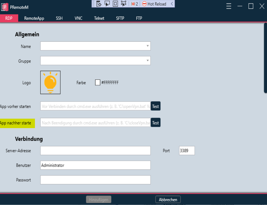
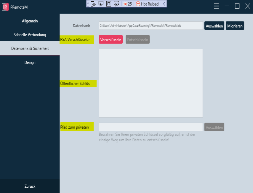
Yellow marked text, get cut off:
@majkinetor commented on GitHub (Feb 18, 2021):
Thanks @NAV-Management, I created #83 to discuss multi conn. options.
@VShawn commented on GitHub (Feb 18, 2021):
@NAV-Management
it is better using 100 × 100 pix image.
Same problem when I try translate it into Japanese. So I wanna re-build UI with Net5 + https://github.com/MaterialDesignInXAML/MaterialDesignInXamlToolkit
the field may change like blow so as to get enough space for description.
@majkinetor commented on GitHub (Apr 6, 2021):
Mot of the items here are either already implemented or have their own ticket so I will close this.